
Responsive Web Design Services
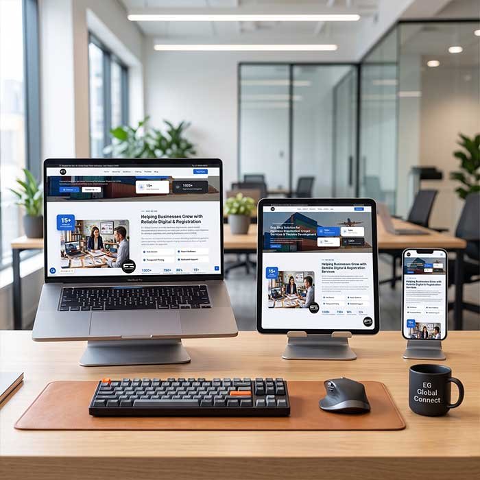
Aaj kal 80% se zyada log websites apne mobile phone par kholte hain. Agar aapki website phone par achhi nahi dikhti, toh aap customers kho rahe hain. Hum banate hain aisi modern websites jo Laptop, Tablet, aur Smartphone—har screen par perfect fit hoti hain.
& Maximum User Experience.
What is Responsive Web Design?
One website that intelligently adapts to any device.
A Responsive Website automatically resizes, hides, shrinks, or enlarges its content to make it look good on all devices. Iska matlab hai ki aapko alag se "mobile app" ya "mobile version" banane ki zaroorat nahi hai.
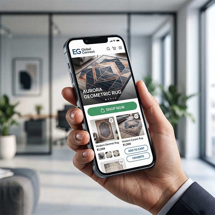
Whether an international buyer is viewing your Bhadohi carpet catalog on a large office desktop, or a local customer is searching for your services on their smartphone while traveling—the text will be readable, images won't get cut off, and buttons will be easy to click.
Why Your Business Needs It
Old, outdated websites are actively costing you sales.
Higher Google Rankings (SEO)
Google officially uses "Mobile-First Indexing." If your website is not responsive, Google will rank your competitors above you.
Better User Experience
No more zooming in or scrolling sideways just to read text. Users get a smooth, app-like experience directly in their browser.
Faster Loading Speeds
Responsive design optimizes image sizes and code specifically for mobile devices, making your site load blazingly fast on 4G/5G networks.
Increased Conversion Rates
When buyers can easily view product details and find the "Contact Us" or "Buy Now" button on their phone, your sales inquiries double.
Cost & Maintenance Effective
You only need to update the content once. The changes will automatically reflect perfectly across laptops, iPads, and Android phones.
Easier Social Media Sharing
When you run Facebook Ads or share links on WhatsApp, 99% of clicks come from mobile. A responsive page ensures the traffic isn't wasted.
What's Included in Our Design?
We build technically sound websites using the latest frameworks like Bootstrap.
Our Design Process
We don't just use templates; we craft experiences.
Discovery & Wireframing
We understand your business goals and sketch out how the website architecture will flow on both a wide desktop screen and a narrow mobile screen.
Mobile-First UI Design
Hum sabse pehle mobile design par focus karte hain (kyunki wahan sabse zyada traffic hai), and then expand the design for tablets and laptops.
Development
We code the website using HTML5, CSS3, Bootstrap, or WordPress, ensuring smooth animations and fast loading times.
Multi-Device Testing
Before launching, we rigorously test your website on real iPhones, Androids, iPads, and different laptop sizes to ensure zero bugs.
Design
Modernize your online presence.
- 100% Mobile & Tablet Friendly
- SEO Optimized Structure
- Fast Loading Architecture
- Custom Brand Colors & Fonts
- Integration with Google Analytics
Discuss Your Website
Have an old website? We also do Responsive Redesigns.
Related Web Development Services
Complete digital solutions to grow your business online.
Frequently Asked Questions
Clear answers regarding modern website design.
Usually, no. For most service businesses, exporters, and even small e-commerce stores, a highly responsive website works just like an app in the browser. It saves you the massive cost of developing and maintaining separate Android and iOS apps.
Yes! This is called a Website Redesign. We will keep your existing text, images, and domain name, but completely rebuild the underlying code and structure so it becomes mobile-friendly and fast.
If your website was built years ago using fixed pixel widths or outdated code (like old HTML/CSS without media queries), it cannot shrink to fit a 6-inch phone screen. Upgrading to a responsive framework (like Bootstrap) solves this permanently.
Absolutely. Google actively penalizes websites that are not mobile-friendly. A responsive design is the #1 foundational step to ensuring your business ranks on the first page of Google search results.
Upgrade Your Digital Storefront Today
Don't let a bad mobile experience drive your customers to competitors. Contact us today to build a website that looks stunning on every device.